Beginning in 1967, Rapoport simplified her process, returning to stretched canvas and working with silkscreen, stencils, and acrylic to create bold, flattened, abstract paintings. Juxtaposing vivid coloration with subtly hued shadow forms, and leaving the raw canvas and pencil guidelines exposed, this is some of the most graphic of Rapoport’s work.
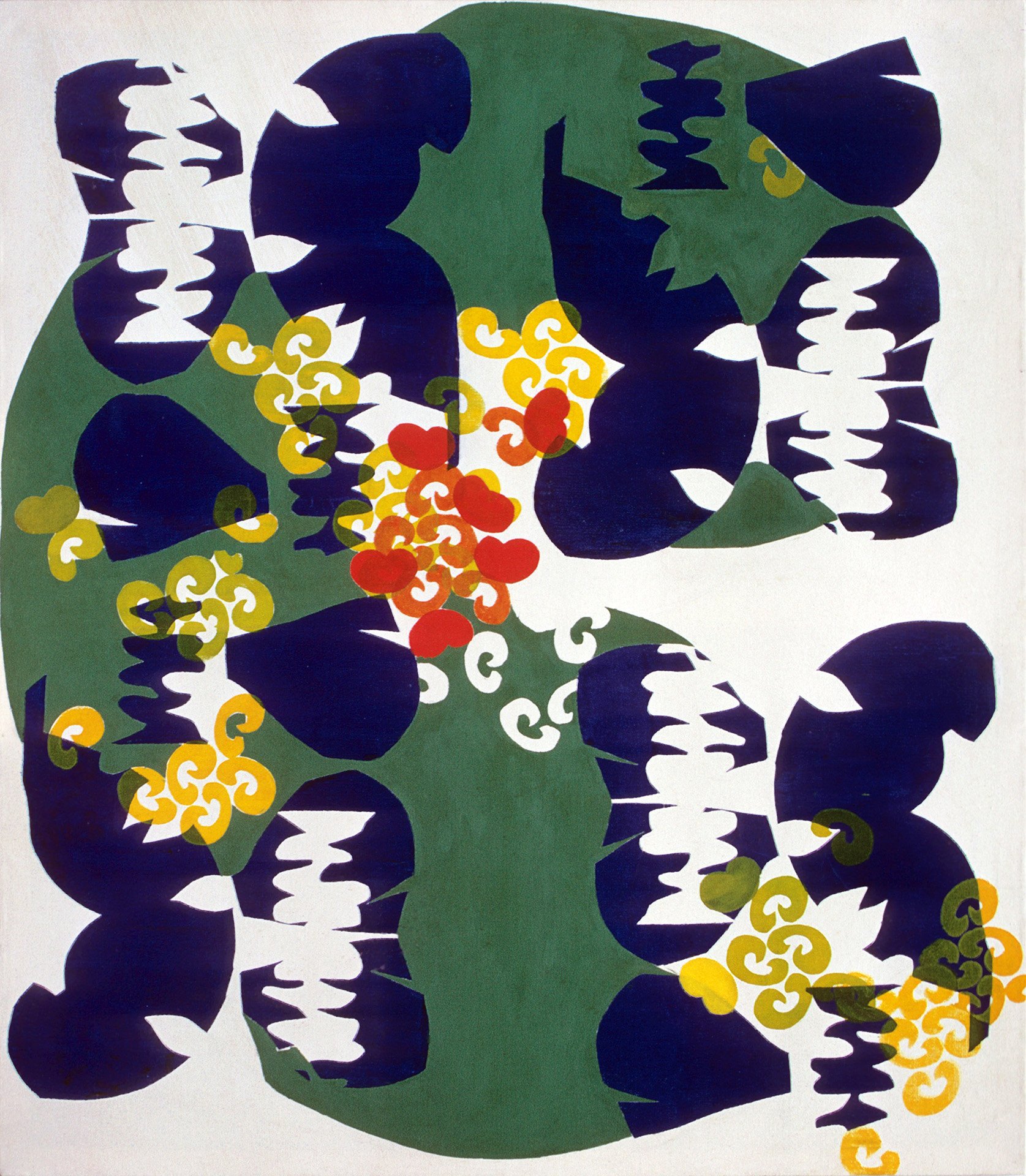
This series expands on the flattened biomorphic shapes present in her earlier Fabric Paintings, and is the first work to use the set of stencil forms that she would reinvent as her “Nu-Shu” language in the early 1970s. These included some recognizable simple shapes, including kidney beans, mandarin orange slices, petals, and curlicues (actually part of a fleur de lis), but also intractably complex and idiosyncratic forms that seem quite specific but defy reference.
Critical response to this work was quite positive. Miriam Dungan Cross of the Oakland Tribune described this work as “lyrical and subtle” with “stylized rhythms.” In her analysis of the work she does not connect the work to feminist critical language. Rather, she says Rapoport “paints intuitively” and “uses shapes that intrigue her – ‘scraps of things around,’” although she does connect the “jagged purple shapes” in Reflections (1968, below) with the “vertebrae of a heart graph.”
These were exhibited in several shows in the San Francisco Bay Area, including at Richmond Art Center in 1968, and were featured on the cover of the architectural magazine Sunset in October of 1969, staged in a modernist Berkeley home designed by Donald E. Olsen.
Rapoport’s work featured on cover of Sunset magazine, October, 1969